|
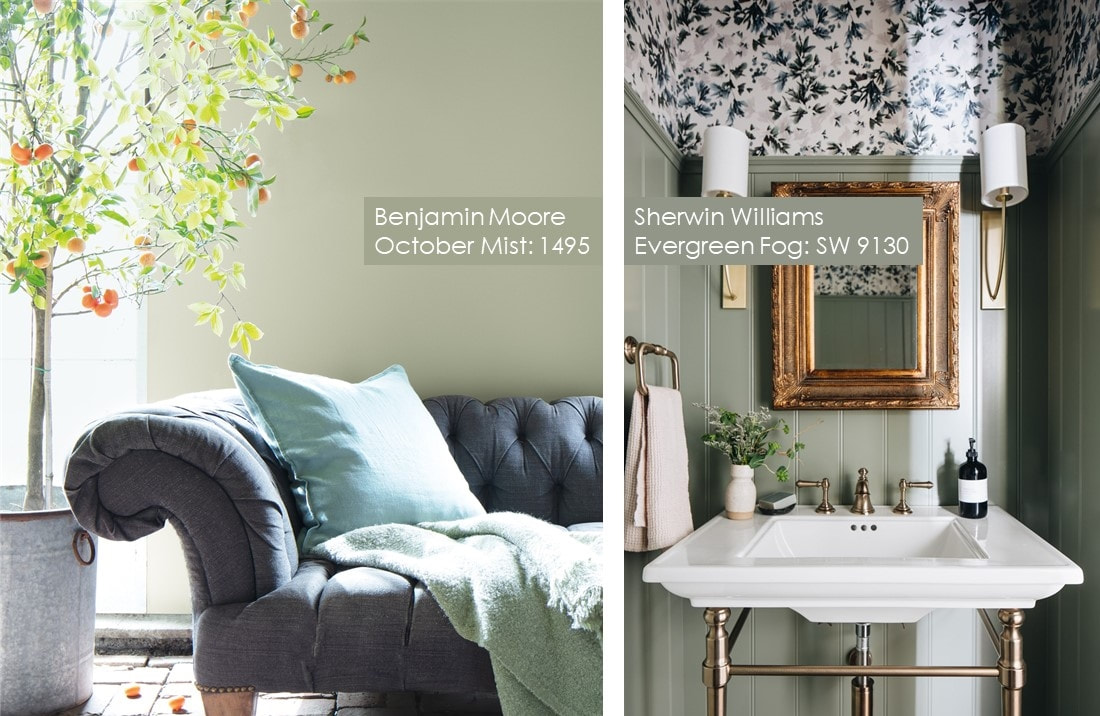
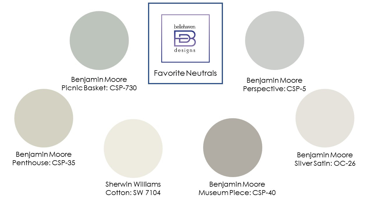
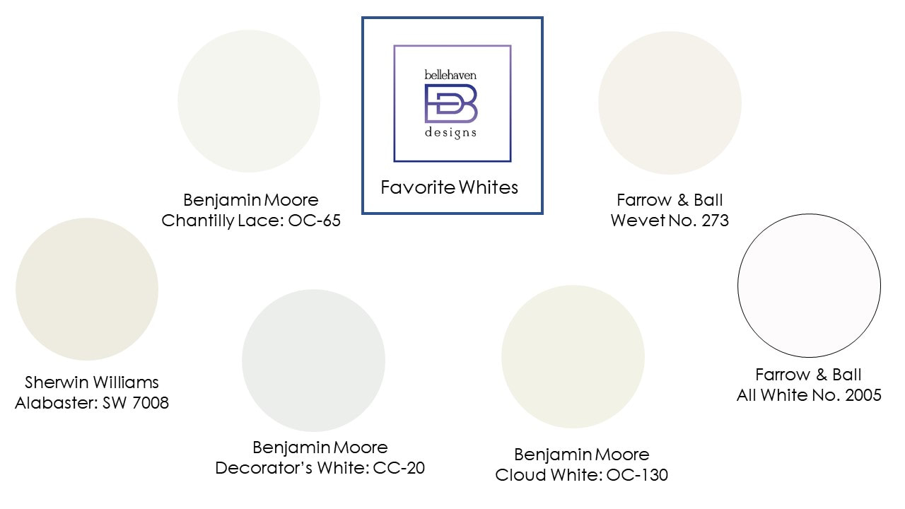
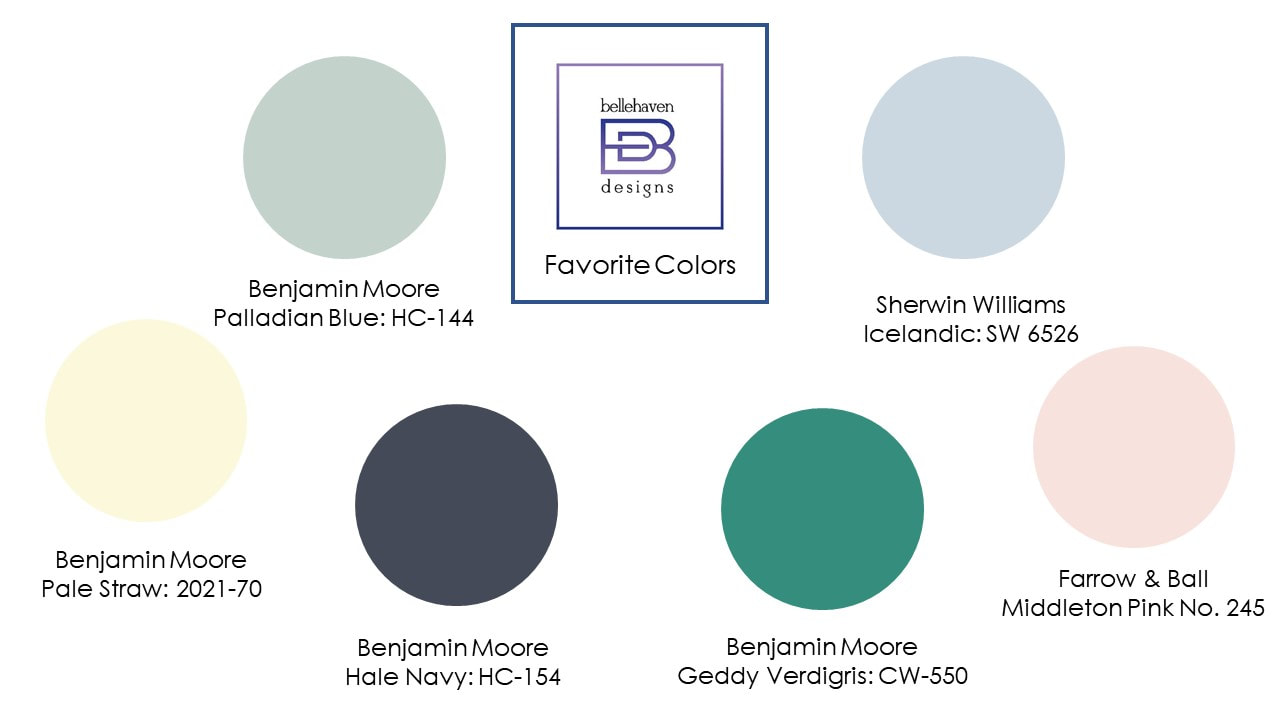
The verdict for this year’s Color of the Year came in late last Autumn, with two of the three paint companies whose paint palettes I recommend, Benjamin Moore and Sherwin Williams (Farrow & Ball is the third) announcing October Mist and Evergreen Fog – pictured above. What immediately struck me is the similarities between both greige-y greens. This isn’t surprising when you consider both companies have color management departments that concentrate on all that’s currently going on in the world around us before finding a color that suits the current psychological landscape. Seeing these two colors might have you wondering if you should paint a room - or several! – in your home one of these colors. My answer: yes and no. It’s an absolute Yes! if either color speaks to you and evokes the types of emotional connection you’d like with your home. But, on the other hand, if you don’t feel strongly pulled towards these colors, then they aren’t right for your home, no matter how current and fashionable the paint companies declare them to be. So what color(s) “should” you use in your home? (First, at all costs avoid the word “should”: in the decoration of your home.) It’s your sanctuary and the backdrop against which your most important relationships - that of your family members – take place. Use colors, patterns, and textures that speak to you and relate to your values. With all of that in mind, please take this review of my 2022 favorite paint colors with a large grain of salt. These colors have spoken to recent client families and/or me. The palettes can be used as a starting point for discovering your own favorite paint colors. And if you’re still a bit stuck, Bellehaven Designs can definitely help you with that! Without further ado, here are three palettes we currently love... The Neutrals:All the above colors have been used in some of Bellehaven’s most recent projects. While some, like Museum Piece, fall on the warmer side of the color spectrum, others, like Perspective, more closely fall in the cooler realm. Regardless, all these colors are soft and provide an almost blank canvas for the other decorative elements in the room, whether that be an art collection, vibrant fabrics and furniture, or to play up the architectural bones of the space in an understated way. Favorite Whites:Sometimes, white walls make the purest statement of your – and your home’s – personality. In fact, one of these, Chantilly Lace, is the default paint color throughout the County Line Properties Home Design Center, where Bellehaven Designs is headquartered. I love its neutrality with a hint of warmth. For the absolute purist, there’s Farrow & Ball’s All White or Benjamin Moore’s Decorator’s White. Favorite Colors:Sometimes the room (or your soul) just craves color. Perhaps the room is saturated with sunlight or vibrant natural views reside just outside your windows. Or it’s a smaller, less architecturally distinctive space, like a powder room that could use a dramatic pop of color. Some of these are soft, like Palladian Blue, others strongly hued, like Geddy Verdigris. Or, Pale Straw is a wonderful antidote to a North facing room, even for those who don’t normally like yellow. Color is probably the most emotionally charged element in the designer’s toolbox. And common wisdom is that a new coat is the easiest and least expensive way to update a room. I disagree. Painting a room involves a great deal of time, requiring you to completely clear the room and drop cloth-cover the heavier furniture. Then there’s preparing the walls, repairing dents and dings in the plaster, drywall, or trim, before finally priming then painting the walls. It’s a lot of time and/or money invested. That’s why I strongly advise against impulsive paint color selections in favor of a more considered approach.
0 Comments
Your comment will be posted after it is approved.
Leave a Reply. |
Welcome to our "PROMOTE"
|
©
2020-2024 Willowbrook Burr Ridge Chamber of Commerce | Website by LislDesign.com


 RSS Feed


